Posts

Showing posts from January, 2017

ARTIST PROFILE

Image
NAME : Brent Nicholas (SALVO) AGE: 18 MUSIC GENRE:  Indie/ Alternative MUSICAL INFLUENCES: Declan Mckenna, Arctic Monkeys (Alex Turner), RatBoy, The 1975, Jamie T, Oasis. MEMBERS: Single member Brent grew up like a normal lad, he used to have guitar lessons and school and got very skilled during his time having lessons, he always loved the Indie fashion and style of music, and used to style himself on what Alex Turner from Arctic monkeys wore. Growing up he was a massive fan of Oasis and used to go to their tours and festivals, however he admits his recent influences have been younger artists like Jamie T, Declan Mckenna, Ratboy as they seem to have more fun on the scene and admits Panic Prevention is one of his favourite albums of all time. Brent started his career when he was clearing out the attic, found his old guitar and discovered he still had a knack for it, he started off with gigs at The New Road Inn, The Donkey, and other bars/pubs like that around Leicester. Br...

DECIDING ON MY MAGAZINE TITLE

Image
DECIDING ON MY MAGAZINE TITLE I have had two ideas about what i want to name my music magazine, BLURRED and DIFFER. The name BLURRED came about when i was coming up with names on Photoshop and i seen that the name looked right on the page, it was previously BLUR until i recognized one of the largest indie bands are called BLUR, with the title BLURRED i wanted to add a smudged affect to the title, and blur it out. With my magazine title i wanted to go for something like THE FLY as it can fill the mast head space and fits the page well, because if you had a small word it would look peculiar on the page. Adding to this i wanted the magazine title to mean something to the audience and also be creative. I randomly came up with the title DIFFER, i then tried to see how it fitted on the page and it also filled up nearly all of the mast head space, also when i looked for definitions of the word i came across, ''to be unlike or dissimilar'' which fits with my target audi...

RESEARCH OF OTHER MAGAZINE TITLES IN CHOSEN GENRE

Image
Q Magazine I like this magazine title as it is simple, and stands out on the page as it is a white letter in a red box. The full name of the magazine is Q magazine, however is presented on the page as just Q. Also it is the only really successful individual/alternative magazine with this style. I also believe that the font of the Q makes the magazine feel sophisticated.  THE FLY magazine This is one of my favourite magazine titles, this is because it is also extremely simple but sits very aesthetically on the page. The title takes up the whole length of the page and stands out with its sharp bold letters. The text is usually black on a brighter more white background. The title shapes the page well because it allows a portion to be taken up nicely, and means the rest of                                           the design can be simple on the page.   ...

RELEVANT PHOTOGRAPHER ANALYSIS

Image
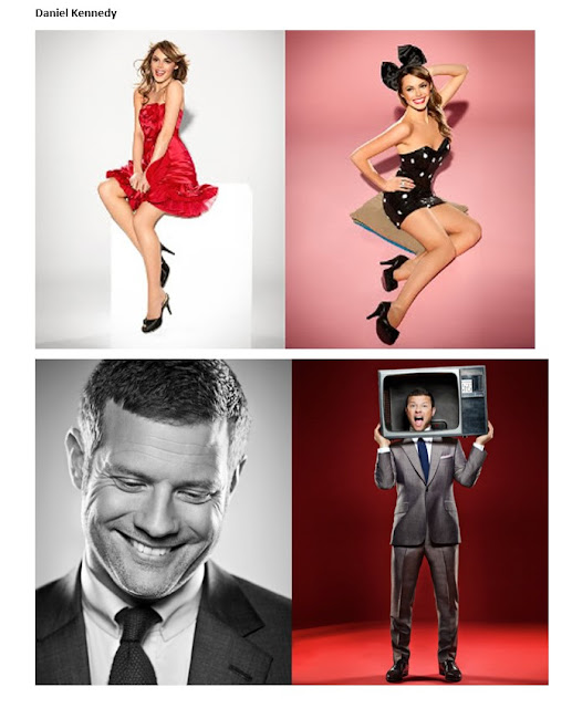
Viktor Vauthier: Victor prefers to use stark white backgrounds with the model wearing mainly white, pure colours, with one or two aspects being a bright colour like red. I am a fan of this style as I believe it makes the photo interesting and depending on the colour you use you can set different tones and moods in your magazine, I will probably not do this for my photo shoot as I want my model to be wearing a few colours and not just have one bright stand out aspect. Daniel Kennedy: This photographer opts to use public figures like Dermott O’Leary. He also likes for his models to show two sides or seen to be having fun, in the examples, he as Dermott smiling then with his head through a TV, then the female above is wearing contrasting outfits, I believe he does this to showcase personalities. Terry Richardson: Terry Richardson is one of the most famous photographers at this time. He is known for just having a white background with the artist in front. This has the effec...

IMAGES FROM PHOTOSHOOT 3 FINAL CHOICE (FRONT COVER

Image

IMAGES FROM PHOTOSHOOT 3 FINAL CHOICE (DOUBLE PAGE)

Image

IMAGES FROM PHOTOSHOOT 3 REFINERY

Image

IMAGES FROM PHOTOSHOOT 3

Image

MAGAZINE PUBLISHER ANALYSIS

Image
RELEVANT MAGAZINE PUBLISHER BAEUR MEDIA GROUP Bauer Media Group  is a European-based media company,  headquartered in Hamburg , Germany that manages a portfolio  of more than 600 magazines,  over 400 digital products and  50 radio and TV  stations around the world. The portfolio includes  print shops, postal, distribution and marketing services.  Bauer Media Group has a workforce of approximately 11,000  employees in 17 countries. Why i have chosen Bauer Media Group I have chosen Bauer media group because they have over 500 different published magazines in different genres. Some of the most popular are HEAT, which is a popular culture magazine, they have Q which is a successful popular Indie/Alternative music magazine. i beleive this company would be most suitable due to the fact they have huge experience and have many popular magazines in all genres ranging from cars, music, culture etc.